ROI works
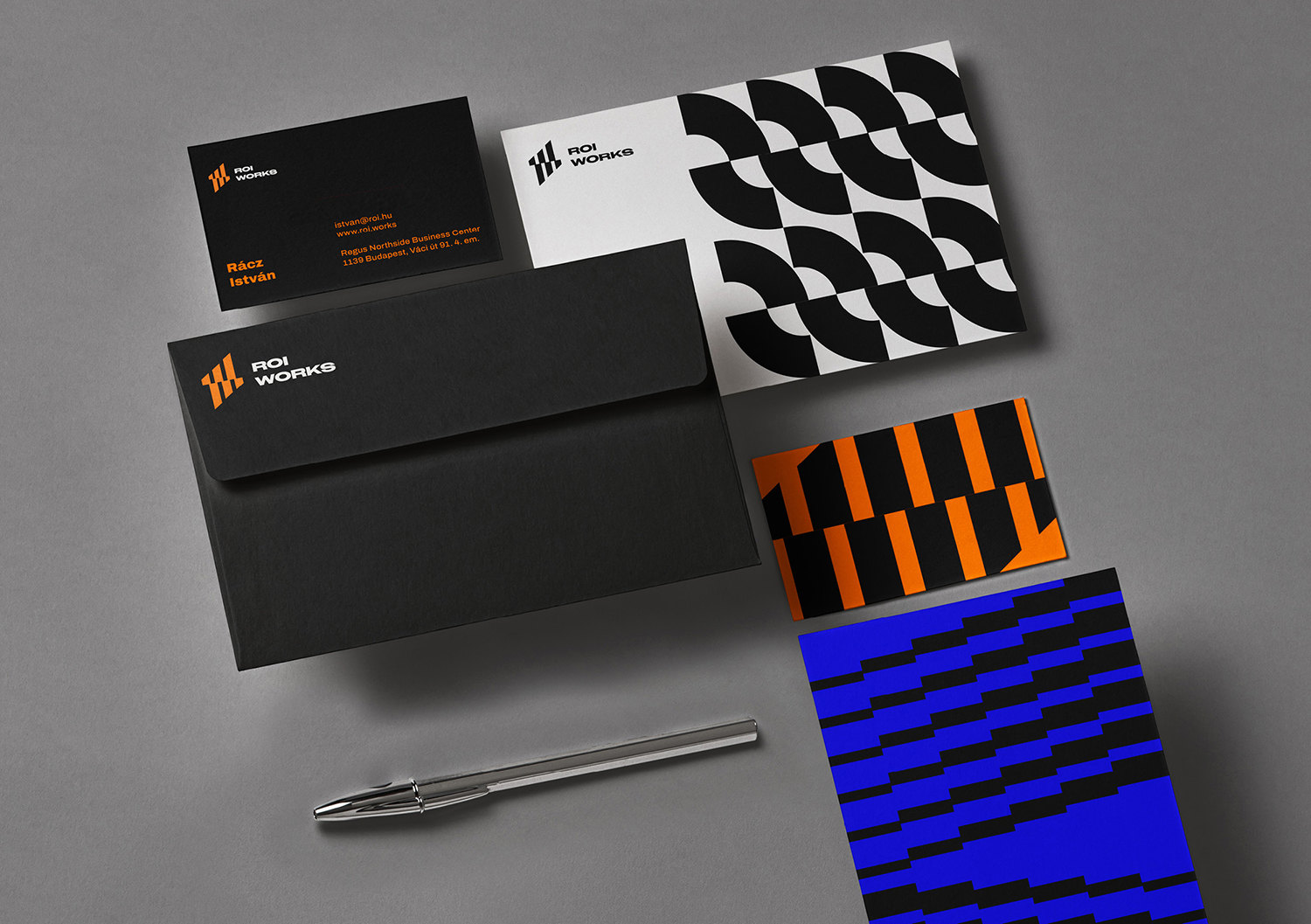
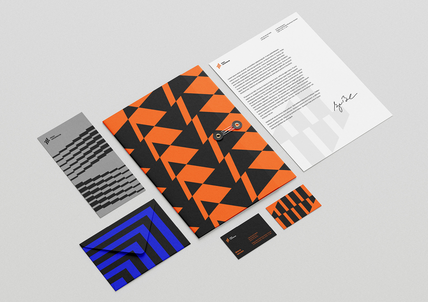
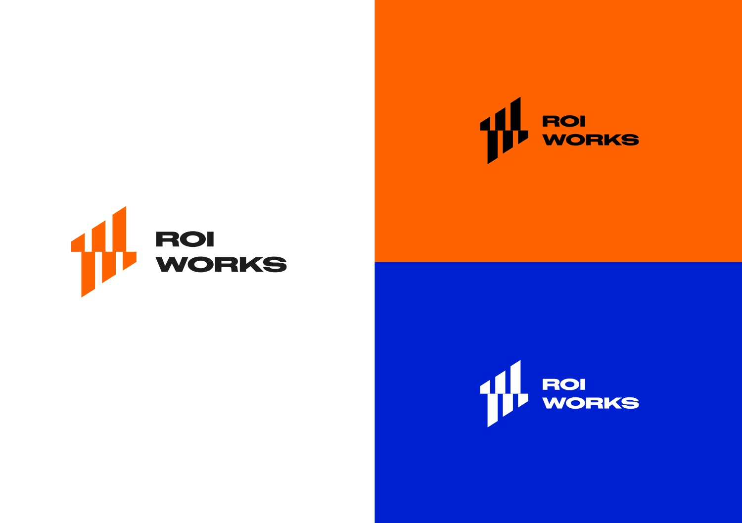
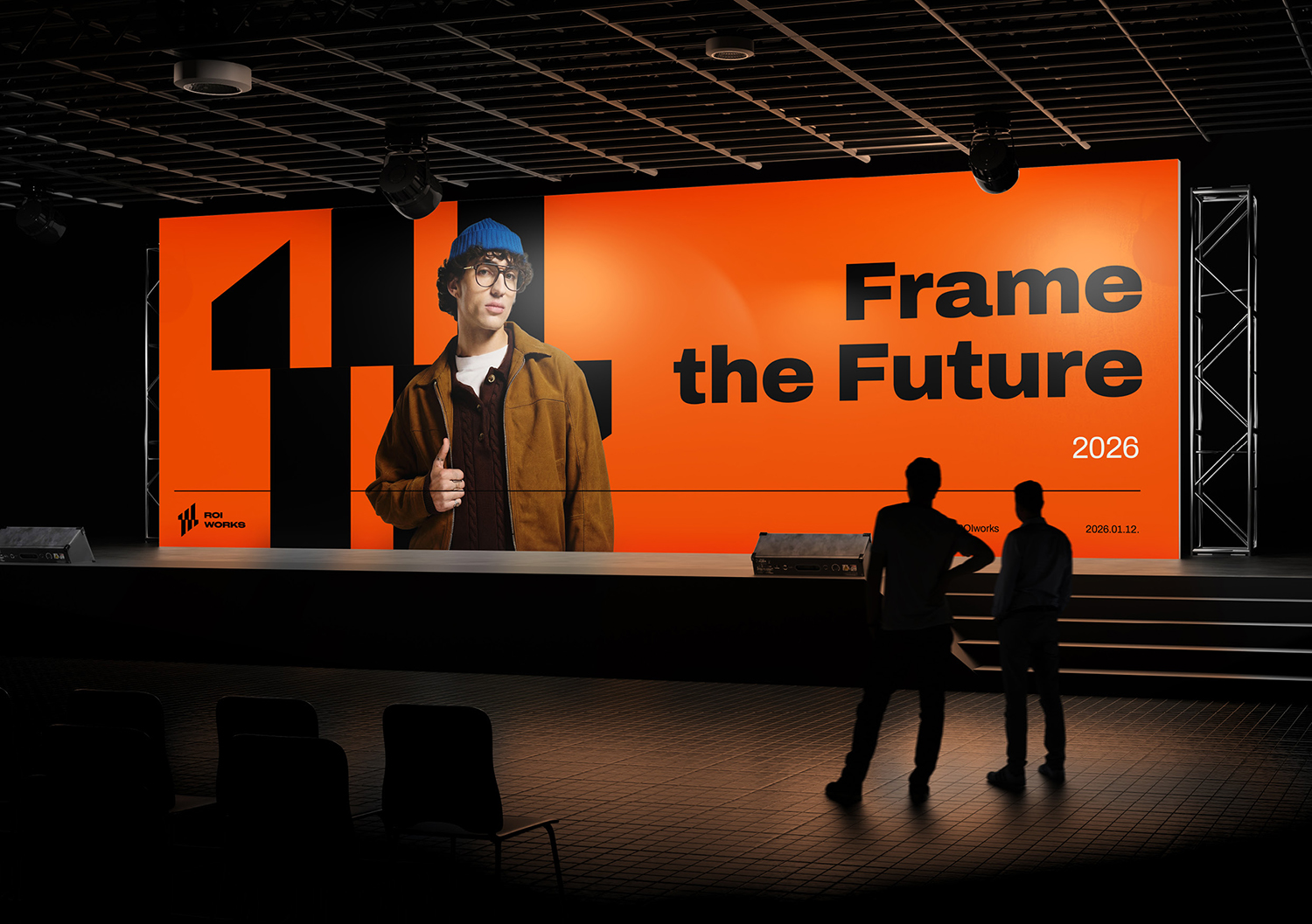
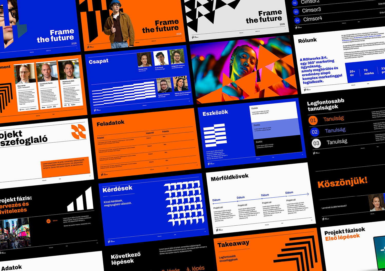
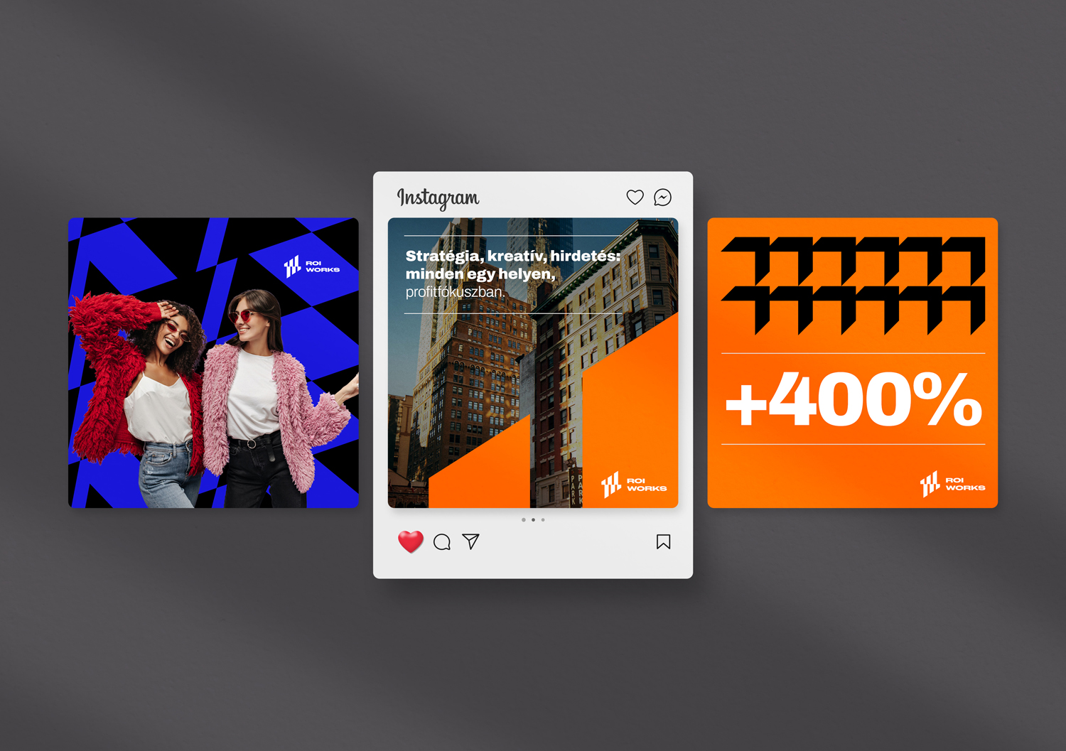
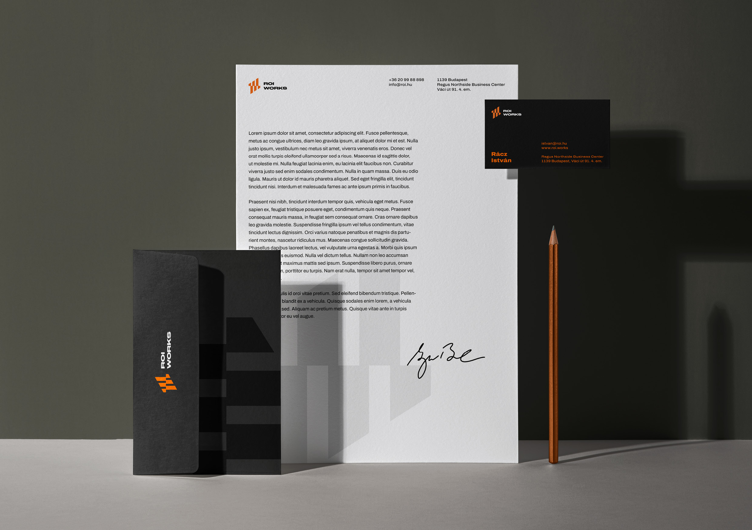
The new visual identity created for ROIworks, a performance marketing agency, puts the visual expression of results and performance at its core. The logo’s upward-moving, bar chart-inspired forms represent clear growth and continuous progress, an idea that is carried throughout the entire geometric visual system.
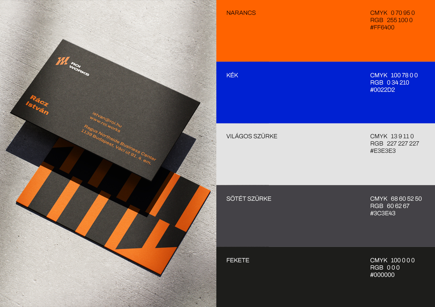
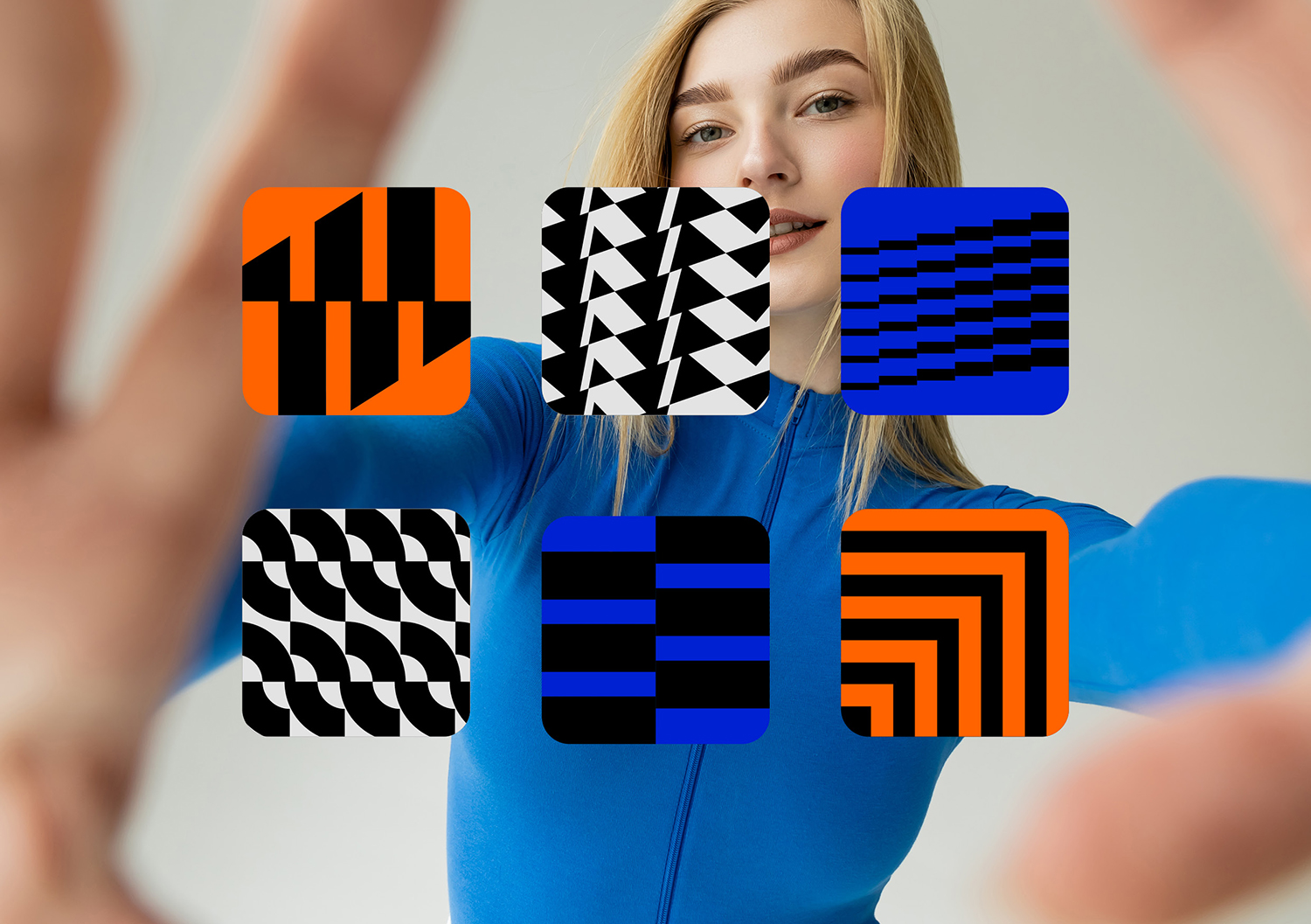
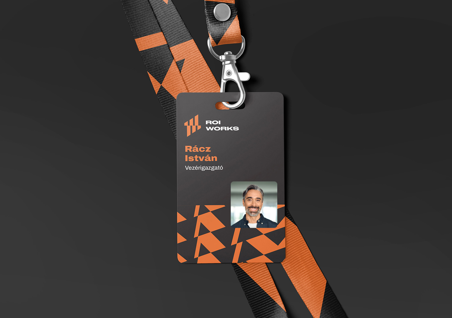
The bold color palette of orange, royal blue, grey, and black is built around strong contrasts, while the colors complement and balance each other. The orange further reinforces the associations of performance and energy, while the geometric elements create a playful and versatile visual system that can be adapted and combined in a variety of ways.
My goal was to create a contemporary, functional, and versatile visual language that offers an engaging yet consistent brand experience through a diverse and flexible set of visual elements.
Do you need a visual identity that feels truly yours and also fits your brand?
You’re in the right place! Let’s work together to build your successful brand communication!